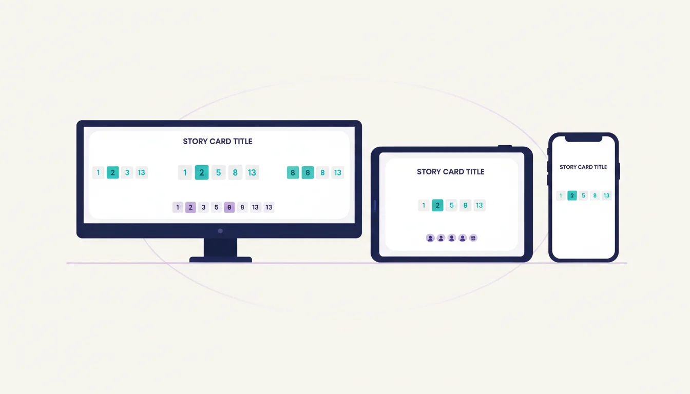
Fully Responsive
Cards, sidebars, and analytics adapt fluidly from 320px phones to 3440px ultrawides.
Estimate from anywhere, on any device
Works in any browser on any screen size. Phone, tablet, laptop, ultrawide. No app to install. Runs on iOS, Android, Windows, macOS, and Linux.
Cards, sidebars, and analytics adapt fluidly from 320px phones to 3440px ultrawides.
No app store downloads. Works in Chrome, Firefox, Safari, and Edge out of the box.
Large tap targets and swipe-friendly card selection designed for mobile voting.
Lightweight pages load in under 2 seconds even on slow mobile connections.
Click the team link from any device with a browser. No downloads required.
The interface adjusts to your screen size. Tap cards on mobile, click on desktop.
WebSocket connections work across all platforms for real-time updates everywhere.
Free plan, no credit card. Create a team and start estimating in about a minute.
Start Estimating Free